Wednesday, December 8, 2010

Lab Assignment #8: Mapping the Census


Mapping Racial Groups by Percentage
in Counties across the United States


The first map is of the percentage of African-American population in the United States by county. The first impression after glancing at this map is that there is very few African-Americans compared to other races, in most of the Midwestern, northwestern, and southwestern states. Although there are slightly higher percentages in the northeastern states, the highest proportions of African-Americans are in the South. It should not be assumed that there are higher concentrations of African-Americans in the southern states; this map only demonstrates where African-Americans are the majority, denoted by the dark green colors (40-90%). African-Americans represent the majority in many counties in the South, which can probably be explained by historical factors. In the time of slavery, African-Americans accounted for an even higher proportion of the population than they do now, due to a small population of white slave-owners and the large number of slaves brought to the South. For various cultural and socio-economic factors, the African-American population has remained as a majority in the South.

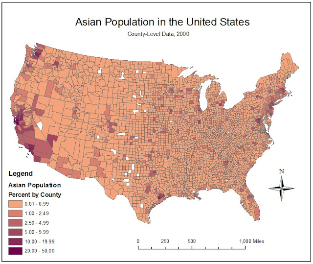
            After examining the map of the African-American population, the percentage of Asians in each county seems much smaller in comparison. The trends in the map of the percentage of the Asian population in the United States are quite the opposite of what was observed in the previous map. The immigration of Asians to the United States was very different from the forced immigration of the Black population. The first major wave of Asian immigrants occurred in the 1850’s due to the California Gold Rush. This lucrative gold search led to a demand for labor to mine gold, harvest food, and construct the railroad. There was also a demand for laborers in the northeast during the industrial revolution. These two historical events deeply influenced the spread and proportion of the Asian population even to this day, as demonstrated by this map.


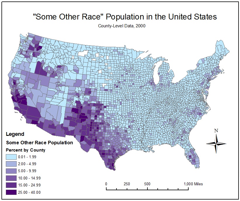
            Although there are several apparent trends in the proportions of “Some Other Race” in counties across the United States, it is difficult to decipher the causes of these patterns because of the ambiguous nature of the racial category. According to the Census definition, “Some Other Race” includes all other responses not included in the specified race categories. This category is mostly comprised of individuals that provided write-in entries, such as multiracial, mixed, interracial, or a specific Hispanic group. Therefore, this map of the percentage of “Some Other Race” by county may reveal the high proportion of mixed-race individuals and Latinos throughout the southwestern states. However, it may be unwise to create policies or make important decisions based on this assumption. Instead the census should be altered to account for the growing number of mixed-race individuals and eliminate the ambiguity of the category of “Some Other Race”.

Conclusions about Census Maps:
            After examining these maps representing the respective percentages on African-Americans, Asians, and “Some Other Race”, there are a few important observations to be made. There are several elements of this map-making process that can lead to misconceptions about the proportions of racial groups in the United States. First of all, it is essential to clearly communicate to map-users that this map shows proportions, not concentrations. This process is strongly influenced by overall population of each county. For example, a county with a very small population could have a high proportion of Asians, but a larger county with a small proportion of Asians may still have a higher number of Asians. Another possible misconception is the result of inadequate definitions of race. Due to the United States’ history as a beacon for immigrants, race is a complex issue and difficult to define. It is essential to alter census categories to account for Americans’ evolving concept of race especially in the case of mixed race and interracial groups.


Conclusions about GIS:


            Throughout this class I have discovered the great potential of GIS in revealing the spatial component of information and data. Sometimes this information can be about physical attributes, such as the burned area of a wildfire, or it can more abstract, such as the proportion of racial groups. The data used to create GIS maps first exists in tables as numbers, which are often analyzed mathematically using statistics to discover patterns. Although statistical data is often helpful in discovering trends in data, incorporating a spatial component enables the mapmaker to view the big picture. However, with great potential come opportunities for misinformation. It is essential for mapmakers to thoroughly state the characteristics of the map so that the map-users’ interpretation is not skewed. The reliability of a GIS map depends on the accuracy of the input data and the proficiency of the mapmaker to correctly assemble the various elements of the map. I look forward to learning more about the capabilities of GIS and becoming a worthy mapmaker.


Citations:

[1] “Ranking Tables for Counties by Race Alone, Race Alone or in Combination, and Two or More Races Populations” U.S. Census Bureau. http://www.census.gov/ population/www/cen2000/briefs/phc-t14/index.html.


[2] “Racial and Ethnic Classifications Used in Census 2000 and Beyond.” U.S. Census Bureau. http://www.census.gov/population/www/socdemo/race/racefactcb.html.


Monday, November 22, 2010

Lab Assignment #7: Mapping the Station Fire

Reference Map of the Station Fire Perimeter


Thematic Map: Populated Areas and Watersheds in relation to the Station Fire


Report:
It has been concluded that “The Station fire is the largest blaze in Los Angeles County's modern history”. [2] The fire was caused by arson on the afternoon of August 26th, 2009 in an area of the Angeles National Forest that had not experienced a major fire in over 60 years. It was named the “Station Fire” because the fire broke out near a mountain peak which contained several radio and television transmission towers. The aftermath of the Station Fire included 160,577 burned acres, 64 destroyed structures, and the deaths of two firemen. [1]
The first map shows a general reference map of the growth of the station fire over a period of five days. It is helpful to observe the perimeter of the fire with respect to the Los Angeles County boundary in order to put its location into perspective. Other features shown on this map are major highways, which help to show how the station fire perimeter is connected to more populated areas, and major bodies of water, which could be potential water sources for firefighters. Another feature of this map is elevation in the form of hillshade map formed from a digital elevation model. Examining elevation is imperative to the analysis of wildfires because drastic changes in elevation corresponding with steep slopes tend to be at higher risks for the spread of fire. [3]
The thematic map demonstrates the relationship between the station fire perimeter, populated areas, and watersheds. Following a major wildfire it is important to study its effect on water quality due to layers of ash. This layer of ash causes the soil to become semi-impervious. Therefore when the first rain event occurs, all of the contaminants in the ash layer are washed into the nearby watershed and carried to populated areas. [5] This thematic map may be used to determine which watersheds near the station fire perimeter flow towards highly populated areas. Luckily most of the rivers and streams do not flow directly through this perimeter but the ash cloud likely affected many of the surrounding watersheds.
Other conclusions that could be derived from this thematic map is the amount of property damage that occurred during the Station Fire. It may be assumed that property area directly correlates to dense populations. If the thematic map is examined it can be concluded that the majority of Los Angeles residents were not at risk to property loss. However, fire officials issued evacuation notices for residents of the 10,000 homes under threat. Although many of the structures were saved from the fire, surrounding homes were still subject to severe property damage. [4]
Hopefully California officials will examine maps such as these and observe important trends to prevent wildfires in the future in order to protect residents, structures, and drinking water quality. There are several ways in which fire hazards can be reduced. If dry flammable vegetation is cleared from these areas, there will be less fuel for the fire. Also special precautions should be used when the Santa Ana winds are active and fire risk is high.
  
References:
[1] "Station Fire Incident Overview." Incident Information System (2009): <http://www.inciweb.org/incident/1856>.
[2] Bloomekatz, Ari. "Station fire is largest in L.A. County's modern history." Los Angeles Times (2009): <http://latimesblogs.latimes.com/lanow/2009/09/station-fire-is-largest-in-la-county-history.html>.
[3] Jones, L.M. "Hazard Science in Support of Community Resiliency: The Response of the Multi Hazards Demonstration Project to the 2009 Station Fire in Los Angeles County." American Geophysical Union. (2009).
[4] Marciano, Rob. "'Angry fire' roars across 100,000 California acres." CNN (2009): <http://www.cnn.com/2009/US/08/31/california.wildfires/index.html>.
 [5] Rust, Brad. "Station Fire Burn Area Emergency Response Hazmat Assessment Report." United States Department of Agriculture: Forest Service (2009): <www.fs.fed.us/r5/angeles/station/BAER/SpecialistReports/HazmatAssessmentReport_PublicRelease_StationBAER.pdf>.


Monday, November 15, 2010

Lab Assignment #6: Using DEM's in ArcGIS


DEM Maps of the Island of Kauai


Description of the Area:

Kauai is the oldest of the main Hawaiian Islands and is the fourth largest, with an area of 562.3 square miles. Kauai originated from volcanic activity, as did the rest of the Hawaiian archipelago. The highest peak on the island of Kauai is Kawaikini, which has an elevation of 5,243 feet. The area east of Mount Wai’ale’ale has an annual average rainfall of 460 inches, which has eroded deep valleys and canyons in the midst of the mountain range. The Waimea Canyon, formed by the flow of the Waimea River, is 3,000 feet deep, earning it the title of “The Grand Canyon of the Pacific”. This contrast of high mountain peaks and deep canyons within such a small area makes Kauai the perfect subject for a digital elevation model (DEM).
The maps below illustrate the island of Kauai which lies between 22.222° (top) and 21.907° (bottom), and -159.738° (left) and -159.293° (right). The geographic coordinate system used is GCS North American 1983.


Shaded Relief Model above a Hillshade Model


Slope Map of Location


Aspect Map of Location


3D Image of Location


Tuesday, November 9, 2010

Lab Assignment #5: Exploring Map Projections

Projections: Conformal, Equidistant, Equal Area

Distance: Between Washington D.C. and Kabul


Conformal Projections: 
Mercator, North Pole Stereographic

Distance: 10119 miles

Distance: 7634 miles


Equidistant Projections:
Sinusoidal, Equidistant Conic

Distance: 8098 miles


Distance: 6975 miles


Equal Area Projections:
South Pole Lambert Azimuthal, Bonne


Distance: 13530 miles

Distance: 6733 miles


            Since the earth is a spherical it is most correct to represent it as a three dimensional image. However, for many mapping purposes, especially in GIS, two-dimensional maps are necessary. All two-dimensional maps are projections with varying accuracy of shape, distance, and area. Conformal projections preserve angles, which make them ideal for navigation. Equidistant projections maintain distance between the origin and other points on the map. Equal area projections preserve areas and size of map features.
            Conformal projections are the most commonly used in most maps. The advantage of conformal projections is that angular relationships are preserved and can be used for navigation. A disadvantage is the distortion of sizes and areas. For example, Greenland is often portrayed as much larger in conformal projections than in reality. This is because distance and size become increasingly distorted when approaching the Polar Regions.
            Equidistant projections are most appropriate when distances are being measured between two points because distance is not distorted. However, the distances will only be preserved in certain conditions. For example the sinusoidal projection preserves distance along latitudes, which was ideal for measuring the distance between Washington D.C. and Kabul. Each equidistant projection has its own conditions for preserved distances, making the use of these maps very confusing.
            Equal area projections maintain the relative size and area of a geographic feature like a continent or country. Similarly to the equidistant projections, equal area projections cannot maintain relative size for all geographic features. Each equal area map preserves area in a certain region or with certain conditions. Therefore it is essential to choose the right equal area projection depending on your region of focus. For example, if you are interested in maintaining equal area in the North Pole region, the North Pole Lambert Azimuthal projection should be used.


Tuesday, November 2, 2010

Lab Assignment #4: Learning ArcGIS

Map for Exercise #1

Map for Exercise #2/5

Graph for Exercise #2

Map for Exercise #3

Map for Exercise #4

Map for Exercise #5

Final Product: Series of Maps related to an Airport Expansion Proposal


Review of ArcGIS: Potential and Pitfalls

After completing the formal tutorial of ArcGIS I have realized the great potential that this program has to transform data and all kinds of information into a visually appealing image. This transformation follows the old saying that “a picture is worth a thousand words” except in this case, a map is worth a thousand data cells. Although the interface of the program is not incredibly sleek or attractive, ArcGIS still gives you the opportunity to create eye-catching visuals with seemingly limitless options for customization. Through the course of the tutorial I was led to create three maps, a graph, and an extent rectangle. However, in the final exercise I was able to make my own choices about color, borders, map elements, and other basic customizations. Through this process of learning all about ArcGIS, I realized how little I know about ArcGIS, but I am more than willing to continue exploring.
In several of the assigned readings concerning neogeography, ArcGIS is often put into the same category as tools like Google Maps which facilitate amateur map-making based on an individual’s experiences. However after completing Lab Assignment #3 which focused on Google Maps and its capabilities, it seems inaccurate to put the two programs into the same category. ArcGIS is more often based on data from the census and other governmental statistics, while Google Maps is usually used as a tool to communicate personal experiences through pictures, videos, and landmarks. From my experience with these programs, ArcGIS seems to be a more scientific approach to mapping than Google Maps. Furthermore, I had much fewer glitches and problems with ArcGIS than I had with Google Maps. With elements like multi-layers, table of contents, legends, and customization, ArcGIS was more useful and reliable than web based programs like Google Maps.

Part of the distinction between ArcGIS and other neogeographic programs is that ArcGIS is more scientific in its analysis of data. Instead of representing sensory data, like pictures and details about experiences, ArcGIS often displays statistical and physical data. Since it is more detailed and complex this program is inherently less intuitive and easy-to-use, which is why the tutorial is necessary. Even after completing the tutorial, I know that I still of much to learn about ArcGIS and all of the tools that were left undiscovered in the tutorial. Also, ArcGIS seems somewhat less creative and user-friendly compared to Google Maps, which allows you to post pictures and videos to significantly enhance observers’ experiences of your map with little to no formal experience.

Another major pitfall of ArcGIS is that there is only one distributor and developer of GIS software, ESRI. This significantly limits the innovation and enhancement of the program because there is no competition to drive improvements. Furthermore, this monopoly has made the price of this program much too high for casual users. The program is only offered to students because of connections with a sponsoring university. Other neogeography programs are more widespread with more users due to the low cost, easy-access, user-friendliness, and the informal, fun uses and purposes.
In conclusion, ArcGIS is a sophisticated program with enormous potential to visualize complex data in order to communicate spatial patterns and trends. However, due to its scientific nature and privatization, ArcGIS is not user-friendly or easily accessible to the average person. I believe that eventually many of its weaknesses will be overcome and ArcGIS will continue to expand its potential to effectively display data.

Tuesday, October 19, 2010

Lab Assignment #3: Neogeography


View Experiencing the Most Sustainable City in the U.S.: Portland, Oregon in a larger map


            As I was exploring google maps and all of the resources at my disposal I realized the power that neogeography has to both improve and destroy the legitimacy and use of maps. One of the major pitfalls of neogeography is misinformation. Usually when a person examines a map, the most difficult tasks are to find out where you are and where you need to go. However, if neogeography takes over and inexperienced mapmakers show incorrect information on their maps, unintentionally or not, then people will have to think critically about whether maps are trustworthy and reliable. Furthermore, within neogeography there is no requirements, standards, or guidelines that must be followed when creating a map. This makes neogeographical maps widely inconsistent and much more difficult to read and interpret.
            In spite of these flaws in the neogeography trend, it seems as though neogeography will revolutionize and advance the way we think about space and locations. Personalized maps created through google maps and other websites allow the public to view a location through the eyes of another person and opens up a new world of experiences. Formerly maps were meant to be object, clear, and for very limited purpose; neogeography has brought mapping into a subjective realm, where learn more about a location beyond just the physical elements. GIS is considered a branch of neogeography due to the combined use of cartography with population data. This program has been a major improvement to mapping since it shows the relationship between location and population characteristics.
            The consequences of neogeography are going to be a combination of benefits and disadvantages. However, the flaws can be minimized by regulation of certain maps that contain essential information and the banning of misinformation of these specific maps. The benefits will continue to increase as new mapping tools and purposes are discovered, especially for GIS.

Monday, October 11, 2010

Lab Assignment #2: Learning How to use Topographic Maps

1. What is the name of the quadrangle?
            Beverly Hills Quadrangle

2. What are the names of the adjacent quadrangles?
            Canoga Park, Van Nuys, Burbank, Topanga, Hollywood, Venice, Inglewood

3. When was the quadrangle first created?
Topography compiled in 1966, planimetery derived from imagery taken in 1978, boundaries, other than corporate, verified in 1998

4. What datum was used to create your map?
            North American Datum of 1927, later updated in 1983

5. What is the scale of the map?
            Ratio 1:24,000

6. At the above scale, answer the following:
a) Five centimeters on the map is equivalent to how many meters on the ground?
            1200 meters
b) Five inches on the map is equivalent to how many miles on the ground?
            1.89 miles
c) One mile on the ground is equivalent to how many inches on the map?
            2.64 inches
d) Three kilometers on the ground is equivalent to how many centimeters on the map?
                        12.5 centimeters

7. What is the contour interval on your map?
            20 feet

8. What are the approximate geographic coordinates for:
a) The Public Affairs Building
            Degrees/Minutes/Seconds: N 34° 04’ 26’’ / W 118° 26’ 23’’
            Decimal Degrees: 34.0739 N, 118.4397 W
b) The tip of Santa Monica pier
            Degrees/Minutes/Seconds: N 34° 00’ 33’’ / W 118° 30’ 04’’
Decimal Degrees: 34.0092 N, 118.5011 W
c) The Upper Franklin Canyon Reservoir
            Degrees/Minutes/Seconds: N 34° 07’ 15’’ / W 118° 24’ 40’’
            Decimal Degrees: 34.1208 N, 118.4111 W

9. What is the approximate elevation in both feet and meters of:
a) Greystone Mansion (in Greystone Park)
600 feet = 182.88 meters
b) Woodlawn Cemetery
140 feet = 42.67 meters
c) Crestwood Hills Park
640 feet = 195.07 meters

10. What is the UTM zone of the map?
            Zone 11

11. What are the UTM coordinates for the lower left corner of your map?
            3763000 N, 361500 E

12. How many square meters are contained within each cell (square) of the UTM gridlines?
            Each square is 1 km x 1 km = 106 square kilometers

13. Obtain elevation measurements, from west to east along the UTM northing 3771000, where the eastings of the UTM grid intersect the northing. Create an elevation profile using these measurements in Excel.


14. What is the magnetic declination of the map?
            The magnetic delineation is 14°

15. In which direction does water flow in the intermittent stream between the 405 freeway and Stone Canyon Reservoir?
            The water flows north to south.

16. Crop out UCLA from the map.